IDENTITY DESIGN & BRANDING
ROLE
BrandingCONTEXT
Personal Project
“Doordarshan” is the national broadcaster of India. The Doordarshan, owned by the
Broadcasting Ministry of India, has been relentlessly providing broadcasting service to
over 132 crore people for over 58 years over a platform
having capacity of 80 SDTV
channels and 32 Radio channels.
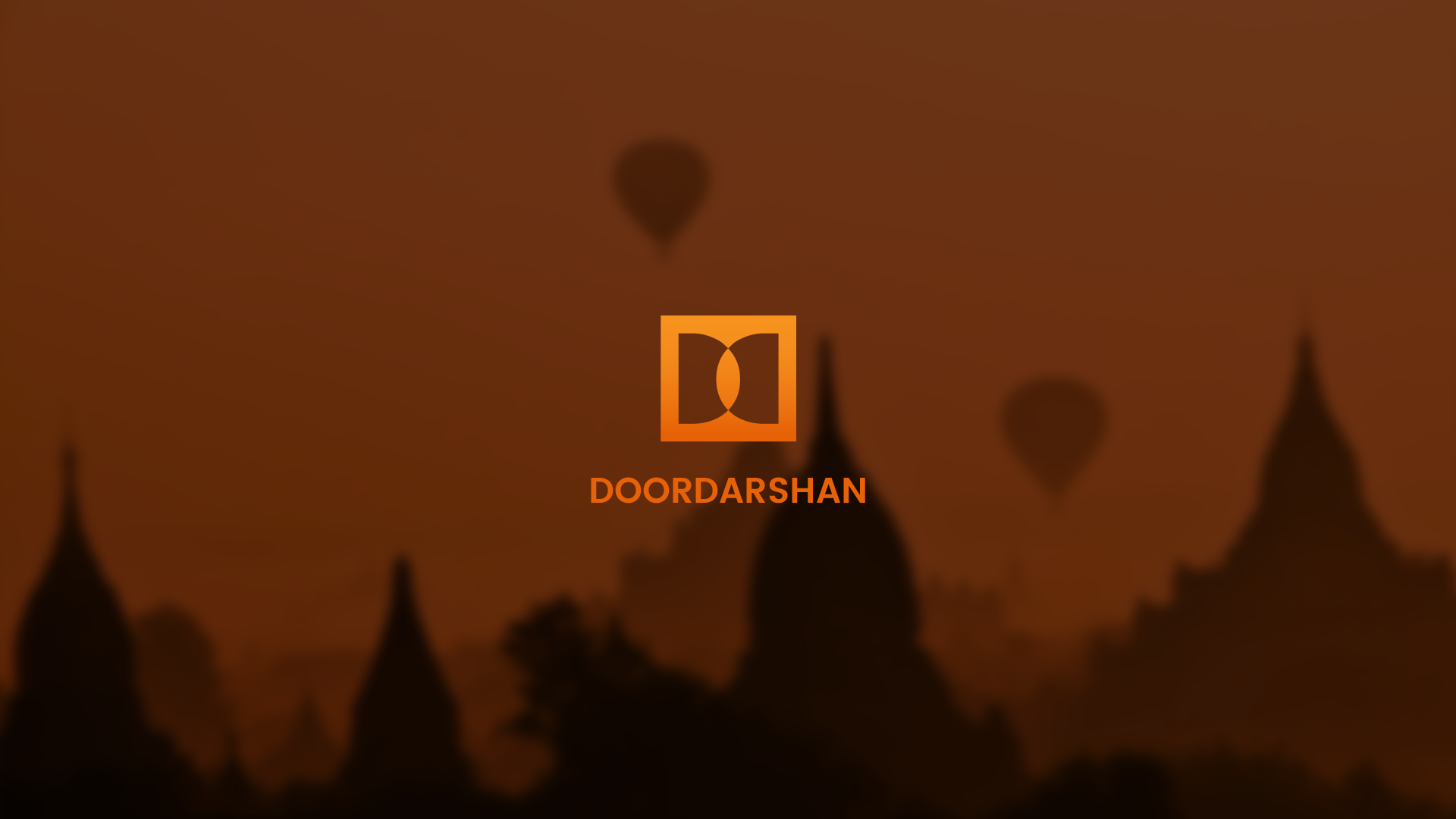
Revamping the “Doordarshan” logo is aimed at framing the logo simple, keeping the
classic essence intact. This logo is a perfect blend of vibrancy and dynamism, carrying the
nostalgia with modern perspectives, and the targeted
audience is expected to connect
with it effectively. The two Ds of “Doordarshan” are placed opposite to each other, forming
a mirror image, which is the primary function of television, to put up a reflection of the
society
on screen. The transparency of the media is characterized by the Ds in the
negative space. The intersection of the two Ds forms the third eye, the eye of wisdom,
which opens and diversifies the vision of the audience. A strong
tint of saffron, used in the
logo is taken from the top band of our National flag, signifying strength and courage. The
intensifying gradient of the logo as well as the convergence depicts the glowing flame of
the illuminated
young minds.
The main idea is to frame the logo simple keeping the essence intact, hence the minimalistic
design approach. The logo needs to portray the vibrancy (through colour) and dynamism
(through shape) maintaining the nostalgia of the
classic vision: the “Doordarshan”.


The variation in the logo color has been engendered to manifest the different
performing sections of the broadcaster with different genres but the structure and
gradient has been maintained to indicate the uniformity of purpose
and the brand.


